
Behind the Screens — The big number
The biggest number on an app's home screen, and the elements around it, are not random choices. They show how the company makes money. Some apps earn when users act — trade, buy, apply. Others earn when users stay still.
-
93%
of mobile banking users open the app to check their balance.
-
87%
to review recent transactions.
1 Federal Reserve, Consumers and Mobile Financial Services (2022); Consumer Reports / NORC nationally representative survey, n=2,019 (2023);
People open the app to know where they stand. Everything else like paying, transferring, borrowing, investing — is something they came to do. The balance is something they always need to see.
Field notes
The behavioral data comes from the United States — measured independently by the Federal Reserve and Consumer Reports. But the pattern holds elsewhere. In Australia, 89% of mobile banking users cite balance-checking as their most frequent activity. Asia-Pacific accounts for nearly half of all global payments revenue.2 The scale changes. The behavior doesn't. People need to know what they have and that need is universal.
2 McKinsey Global Payments Report (2023).
Anatomy of the screen
The same five parts show up on almost every money screen. Each one tells you how it earns — and which way it leans you, toward act or stay.
-
The biggest number
The biggest figure is what it wants you to feel. One that changes, you act; one that holds, you stay.
-
Its motion
Motion is an invitation. A figure that ticks live pulls you to act; a still one lets you stay.
-
Its color
Color is a signal. Green or red flags a moment to act; one calm, plain tone tells you to stay.
-
The main action
The loudest button is the move that pays. It commits you, you act; it stays quiet, you stay.
-
What's beside it
What sits alongside is what's wanted next. An extra action in reach, you act; nothing beside it, you stay.
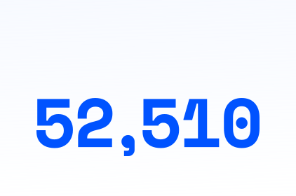
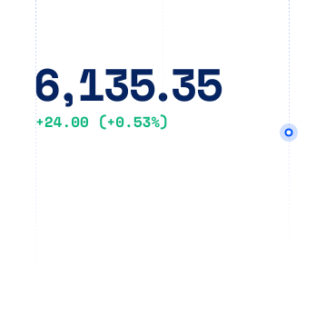
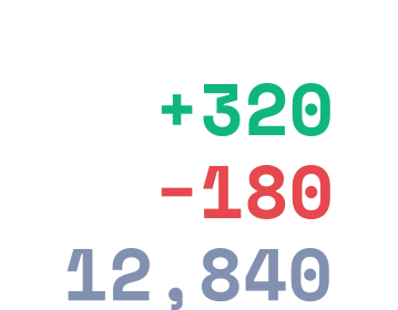

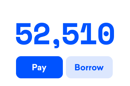
Every money app earns one of two ways: the moment you act, or while its balance sits still.
We analyzed 9 money apps across 3 categories to identify the patterns in how they earn.
- Coinbase
- Binance
- Chime
- Cash App
- Revolut
- Public
- Nubank
- Acorns
- Wealthfront
You can read the full breakdown when you download the free report
Download Free ReportThe biggest number is what your portfolio is worth — moving, green or red.
A live, green-or-red number with a Buy button means they earn when you trade.
When the number keeps moving, people keep trading.
Revenue Model
Coinbase makes most of its money — about $4 billion in 2024 — from trading fees, win or lose. The simple "Buy & sell" flow costs more than its advanced screen.
Design that drives business
"Buy & sell" sits one tap away on the home screen — so the easiest path is also the most profitable one.
- A
The biggest number is your portfolio — and it moves. A number that ticks is a reason to look again.
- B
A live chart, set to "today." It invites you to form an opinion.
- C
"Buy & sell" sits right under your thumb. One tap from impulse to trade.

The biggest number is your spendable cash — what you can move right now.
One plain figure. No fuss. Almost every e-wallet shows it this way, because they earn each time it moves.
When you earn each time money moves, moving it is the main thing.
Revenue Model
Revolut earns across the board — card swipes, currency exchange, interest, subscriptions, and trading. Money moving through it pays, however it moves.
Design that drives business
The home screen is built around accounts and actions, not one balance — every tab is another way to move money, and each kind of movement earns.
- A
The balance is labeled by currency. Swipe and it changes — each currency is its own account.
- B
"Add money" and "Move" sit up front. "Move" is how you shift and convert between currencies.
- C
The feed's main event is the exchange — one of several ways the app earns.
- D
Invest, Payments, Crypto, Lifestyle — more ways money moves and earns.

The biggest number is your total savings — or what it could grow into.
A calm, forward-looking number built so you stay in, because they earn while you stay.
When you earn on cash and investments, you pull every account in.
Revenue Model
Wealthfront earns two ways — a 0.25% fee on what you invest, and a spread on cash. Advisory is about a quarter of revenue; cash brings in most of the rest.
Design that drives business
The screen rolls every account into one net-worth number, idle cash and "Start Investing" side by side — and growing that number means moving more money in, wherever it lands.
- A
The biggest number is your net worth — every account consolidated into one view.
- B
The chart is framed as growth — your money's trajectory, not just a balance.
- C
A high-yield cash account sits in the list — earning its own spread, not just waiting to be invested.
- D
"Start Investing" and "Add account" — every button pulls more money under one roof.


We believe your user interface is your business model — made visible. It shows how your company makes money, whether you meant it to or not. The only question is whether yours was designed on purpose.
Download Free ReportEvery category has something behind the screens — the patterns that describe how the business runs.
get.insights@frostdesigngroup.comFrost Design Group is a user interface design agency based in Manila. We design experiences used by millions.

John Paul de Guzman
John Paul de Guzman is the Chief Creative and Founder of Frost Design & Consulting Group, a growing user interface design agency based in Manila. He has been a designer for more than 20 years and is behind major digital product redesigns used by millions of Filipinos. He speaks and writes about design practice, operations, and leadership.